10 May

The Blip: On My Quest to Create a Minor Personal Security Risk

Plenty of apps nowadays include a feature to share your live location with designated people, for a variety of reasons. I’ve personally found live location sharing on Uber and Messenger invaluable for meeting up with friends—no more “how many blocks away are you?”—while others have found it useful as a security feature, so trusted friends know where they are on their trip or hangout.

One of the more interesting implementations of this feature is the one in Google Maps: instead of providing your location for a specific itinerary or for a block of 60 minutes, Maps can actually allow the other person to see exactly where you are, forever (or until you turn the sharing off). It’s pretty neat and integrates into the app as smoothly as one would imagine—I can just pull up Google Maps, zoom out, and see pins where certain of my friends are right now, just as I can find my favorite trailhead or halal cart marked on the globe. It’s useful for safety reasons, and also for a group of friends exploring a new city to find each other after wandering off a few separate ways. But to a set of my friends who like to travel the globe, the main appeal is in being able to know if someone else happens to be in the same city who might be down for an impromptu meetup.

The world is watching. Source: Anna Shvets via Pexels.

There are two things I’d change to make it more useful for this latter use case, though:

  1. It should be more accessible. I don’t want to have to individually invite specific friends to have access to this feature. On their side, it’s a bit of a commitment to accept the invite and permanently welcome a big-ass pin on their Google Maps; on my side, it’d feel like I’m picking favorites.
  2. It needn’t be so precise. I don’t really care for my friends to know exactly which bathroom stall I’m pissing in, but it would be nice for them to see what city or general region I’m around. This is an even bigger issue if I do make it accessible to more than just close friends, obviously.

The Interface

Conveniently, my homepage already had a whole section dedicated to mapping locations. It’s a world map in the Mercator projection with my travel and residential history since 2013 plotted out as arcs and dots. (Getting the functions right for transforming latitude and longitude to pixel coordinates was actually a fun little task a few years ago. There’s plenty to be said about issues with representation in Mercator, but it does make for some tidy equations when figuring out where to stick a marker.) This would be the perfect place for a current-location indicator.

With the venue chosen, the next step was to design the indicator. I’d always been a fan of cyberpunk aesthetics; one of my hobbies is spending all day on a nifty cyberpunk interface that doesn’t actually do very much. So the first thing that came to mind was this radar blip:

Something about pulsating dots really makes them irresistible. Source: SkotosStudio via YouTube.

A whole scanner beam might be excessive, but it does feel nice to have two complementary components that build up that “pulsing” sensation. The first is the “core,” which feels a little bit like a bouncing ball seen from above, with opposite timing functions on the “grow” and “shrink” phases:

The second is the “nova,” which keeps expanding as it fades away:

Of course, we still need it to look okay in browsers that don’t support animations, so we make sure that it’s still recognizable without them:

Putting it all together, this is what the Blip looks like:

The Data

Now I faced a conundrum: where would this data come from, and how would it get onto my homepage?

The second question shouldn’t have been hard, but I’d already committed myself to keeping it free of client-side code as part of my useless crusade against JavaScript, one of my favorite languages. Furthermore, the page was a static file generated by Cleverly, which meant I couldn’t run any server-side code, either. In the end, I settled on a stupid hack to update the tag on the live page using a cron job. (Hey, that’s what this category is for.)

As for data retrieval, it would’ve made sense for the location to be pulled from my device location on Google Maps, but Maps doesn’t appear to have a public API. (Fair enough.) Luckily, I did have a more accessible method of geolocation thanks to the Tasker Tracker project I wrote about in the last post: every time I record my activity, my current coordinates get logged to Google Sheets.

The easiest way to get this info off would be through one of Google’s client libraries, but I took this as an opportunity to get familiar with OAuth by handling the requests myself. Google still documents their OAuth handshake process to support “limited-input devices,” so I pretended I was a smart TV and followed that guide.

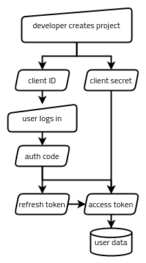
In the end, Google’s OAuth wasn’t very difficult to work with. There are basically five strings being passed around in one way or another:

  • The client ID, which identifies the application as a whole (like a username for the application).
  • The client secret, which authenticates the application as a whole (like a password for the application).
  • The authorization code, which represents a single user (me) authorizing the app to access something specific (my Google Sheets data).
  • The refresh token, which represents that authorization having not been revoked.
  • The access token, which is what actually gets traded for the data we want (my Google Sheets data).

If you’re curious about building something similar, the whole process looks something like the following:

  1. Via the Google Cloud Platform web interface, create a GCP project, enable the Google Sheets API for it, and set up an OAuth client ID and client secret pair. This gets stored in a box (somewhere accessible to the app but inaccessible to the public).
  2. Our app generates a special Google auth link, which the user uses to authorize the app (via a web interface). This gets the authorization code passed back to the app.
  3. Our app trades the authorization code for a refresh token and an access token. These get stored in our metaphorical box, too.
  4. Our app tries to use the access token to access the data. If it’s expired, it trades the refresh token for a new access token and tries again.

From that point on, we should only have to keep running step 4 to get the data we need. If the refresh token is no longer valid (such as if the app’s permission to access that user’s data gets revoked), we start back at step 2. If the GCP project’s own credentials get revoked, we start back at step 1.

Here are the two APIs I ended up accessing for this project:

João Dias’s guide to setting up Google Sheets API access in Tasker (which incidentally is another “limited-input device”) was a great resource for the first few steps above, in addition to helping me set up the data recording in Tasker Tracker to begin with.

The code to retrieve and update the Blip’s location can be found here.

6 Feb

Stupid CSS Part 2: Whac-A-Mole

This post is part of a series diving into the concepts behind the Stupid CSS demo page, a collection of interactive elements implemented in pure CSS at various levels of absurdity. Check it out on GitHub!

Look ma, I got published.

Tags:

23 Dec

Stupid CSS Part 1: Double-Click Handler

This post is part of a series diving into the concepts behind the Stupid CSS demo page, a collection of interactive elements implemented in pure CSS at various levels of absurdity. Check it out on GitHub!

One of my favorite thing to do with code has always been making it do what it’s not meant to do. My first experience with programming was on a graphing calculator, making games that were progressively grosser abuses of a math-teaching device; maturing into other areas of software development, I’ve carried with me that attitude of making the most satisfying interface out of the fewest resources possible. It’s part consideration for not-so-high-end client machines (including my own), part self-imposed challenge to keep things interesting.

A fun way to apply this challenge in web development is to build an interactive site without JavaScript. It’s useful, too: Not only does invoking the JavaScript engine incur a bit more network and processing power to run a webpage, but it also excludes users who can’t run scripts in their browser at all, whether for performance reasons, hardware limitations, or privacy concerns. Giving old, JavaScript-less browsers as close to the full experience as possible is the ultimate form of graceful degradation.

Organic JavaScript-Free Eggs

That got me thinking: What’s something quintessentially JavaScript that I could attempt to recreate in CSS?

An event handler.

In particular, a dblclick (double-click) event handler would be something particularly stupid in CSS. Not only does CSS not have any notion of events—the :hover, :checked, and other pseudo-classes being selectors of state—it also doesn’t have any way to express time intervals, much less to condition behavior on the passage of a certain amount of time. These two ingredients are exactly what make up a double-click event, after all: two clicks occurring on the same element within a threshold time interval.

As it turns out, CSS does—sort of—have a way to describe time intervals. It’s just wrapped up in a neat little CSS3 module called CSS Animations.

<marquee /> Is Dead, Long Live <marquee />

Animations in CSS are a way to describe how CSS properties should change with time. They’re similar to CSS Transitions, which describe how properties transition from one state to another, usually smoothly. The difference is that animations are much more powerful, allowing us to do such things as repeat, pause, or set keyframes on the animation.

For example, a common pattern in web design is to have a button that changes in color when hovered over:

Sprinkling on some transitions can make it feel more slick:

If you’re not into the whole subtlety thing, adding animations can really spice it up:

Many properties in CSS can be animated. Most relevant to us are the properties of position: top, right, bottom, and left.

Accessibility Issues

As you can gather from the last demo above, a terrible animation can make it hard to click what would otherwise be a straightforward button. What if we used that to our advantage?

Here’s the big idea: When the user clicks on a button, we give them a small amount of time—400 milliseconds seemed about right from trial and error—before an intervening animation makes it not just hard but impossible to click the next button in the sequence. If the user manages to click a second time before the 400 milliseconds are up, we congratulate them on performing a double click. Otherwise, they get left in the single-click zone.

Voilà.

The way it works is that the button you see is actually just a viewport into an absurdly long column 4,800,000 pixels high. This giant column is split equally into three zones: the “Click Fast” zone, the “Single-Clicked” zone, and the “Double-Clicked” zone. Each of the Single-Clicked and Double-Clicked zones starts with a 400-pixel tall block, both of which link to the Double-Clicked zone; the rest of these two zones, as well as the entirety of the Click Fast zone, link to the Single-Clicked zone.

With a CSS animation on the top property, this whole column is constantly zooming upwards relative to the button viewport at a rate of 1,333 pixels per second.

The demo starts off with the button viewport showing the top of the Click Fast zone. A single click takes the user to the top of the Single-Clicked zone (at the top of the first blue section). What happens next depends on how quickly the user performs a second click:

  • If the second click comes quickly enough after the first (as on the left side of the recording), it happens on the double-click (blue) element and the user is taken to the top of the Double-Clicked zone.
  • Otherwise (as on the right side of the recording), it happens on the single-click (yellow) element and the user is left at the top of the Single-Clicked zone.

Hash/Tag Problems

The way these blue and yellow elements jump to the tops of their respective target zones takes advantage of the fact that linking to a fragment scrolls to the target even if the target is in an unscrollable parent, which makes it seem like the page is loading new content on the fly.

This is my favorite way to create dynamic content on pages without JavaScript—it’s similar to a technique sometimes termed the checkbox hack, but it works in a much wider array of browsers, including ones from the last century. (Check out my write-up of the File Browser demo for an in-depth look at this effect and how it can be used for pure-CSS dynamic galleries compatible with Internet Explorer 5!)

Unfortunately, this approach carries a few problems that leave the demo with much to be desired:

  • Because we want the label of the current zone to show up in the middle of the button regardless of how far into the zone we’ve scrolled, it needs to be position: fixed. This means that the button needs to be in a predictable location on the page (so the page can’t scroll) and that this location needs to be calculable using CSS units (so the button can’t flow with text).
  • The only content that can be conditionally shown has to be inside the button, so while we can have a neat demo where the button’s label reflects the fact that a double-click took place, we can’t use it to control anything else. So much for a double-click handler.
  • Although Internet Explorer 10 and 11 support all of the features required by the demo, they also treat double clicks on a link as a single click, so it actually takes three clicks within 400 milliseconds to get the “Double-Clicked” label to show up.

The State Machine

Avoiding the checkbox hack also doesn’t do us much good since none of the browsers it excludes (i.e., Internet Explorer 8 and earlier) support CSS Animations anyway, so I went ahead and rebuilt the demo using hidden radio buttons:

This version is a bit simpler to explain. There are three radio buttons set to display: none and four sets of labels: one for “Click Fast,” two for “Single-Clicked,” and one for “Double-Clicked.”

  • When either of the first two radio buttons is selected, the button shows one of the Single-Clicked labels.
  • When the third radio button is selected, the button shows the Double-Clicked label.
  • When none of the radio buttons are selected (on the initial load), the button shows the Click Fast label.

As soon as the selected radio button changes, the newly loaded label gives the user 400 milliseconds to click and toggle the double-click radio button before the label is replaced with a visually identical one that toggles one of the single-click radio buttons. (Since we don’t need things to scroll upwards anymore, I set this animation to animation-timing-function: step-end, which makes the transition instantaneous.) The reason there are two single-click radio buttons is that only a change in which radio button is selected can trigger the animation to run again, so each of the Single-Clicked radio buttons needs to be able to trigger the other. Otherwise, the user would never leave the single-click state after the 400 milliseconds are up.

This whole business can be summarized in one small state machine:

Thus began my quest to build a demo of the most egregious abuses of CSS on a single page.

Tags: